Color Theory for Dummies


by The Chromatic Bananas

Color Theory for Dummies is a website that uses interactive examples, games, and images to teach dummies about the elusive concept that is color theory. Is the dress white and gold or is it black and blue? Is the sneaker grey and teal or white and pink? How does context change the way we perceive color? We’ll teach you some basics, and you’ll put your newfound knowledge to the test in a couple of games. We present to you: Color Theory, made by dummies for dummies.

What is Color Theory?

Color Theory is the study of how colors interact, are perceived, and evoke emotions. Artists use color theory to make intentional choices in their works, whether that be in crafting form, representing light, or expressing mood.


There are three key aspects of color theory: color wheel, harmony, and context. Some other aspects include mixing, schemes, and psychology.

Defining Color

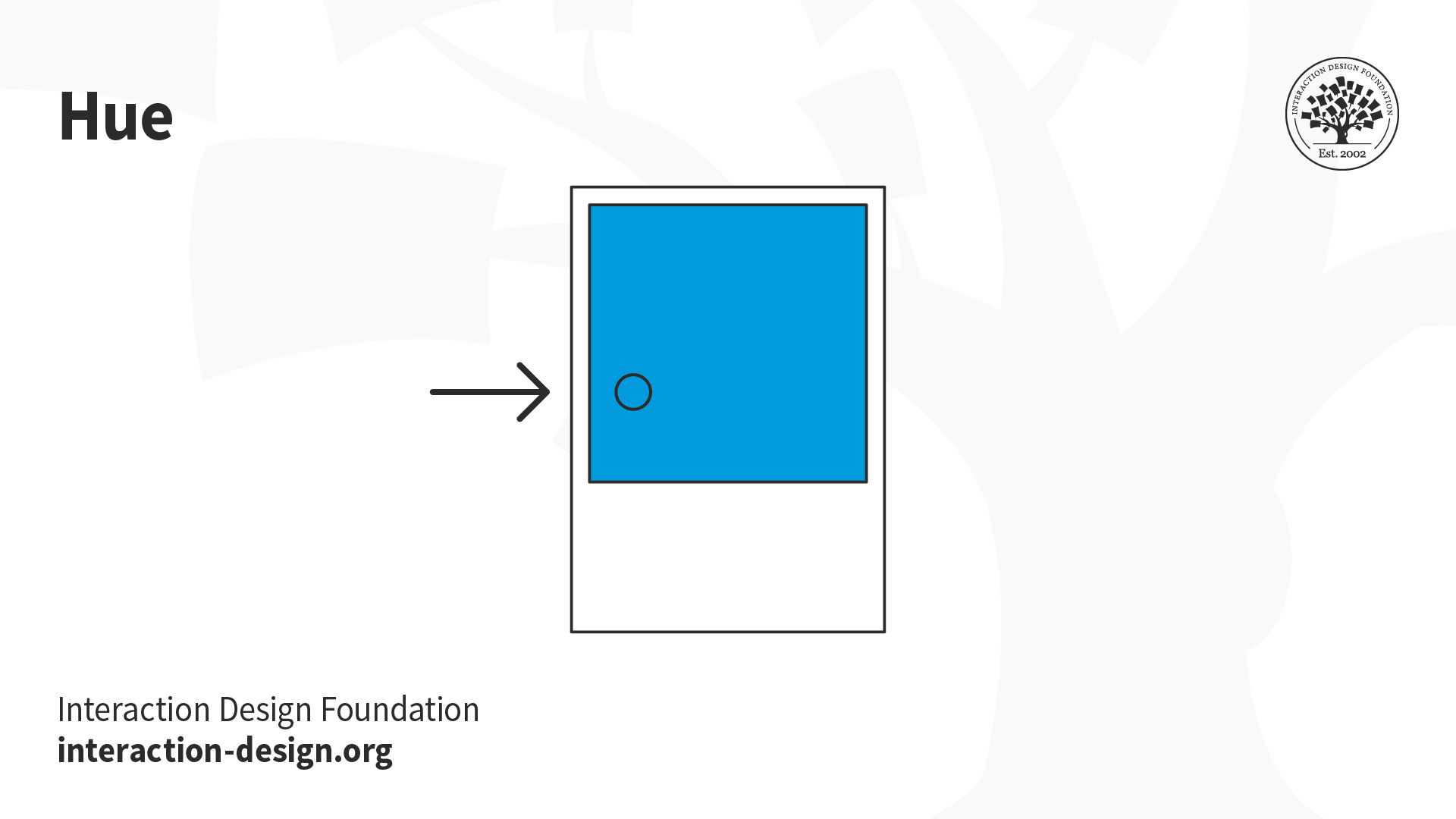
Hue, saturation, and brightness are the three primary ways to describe colors.

Hue is the “color” of colors. It’s what distinguishes blue from red. It’s probably the first thing that comes to mind when you’re asked to imagine two different colors.

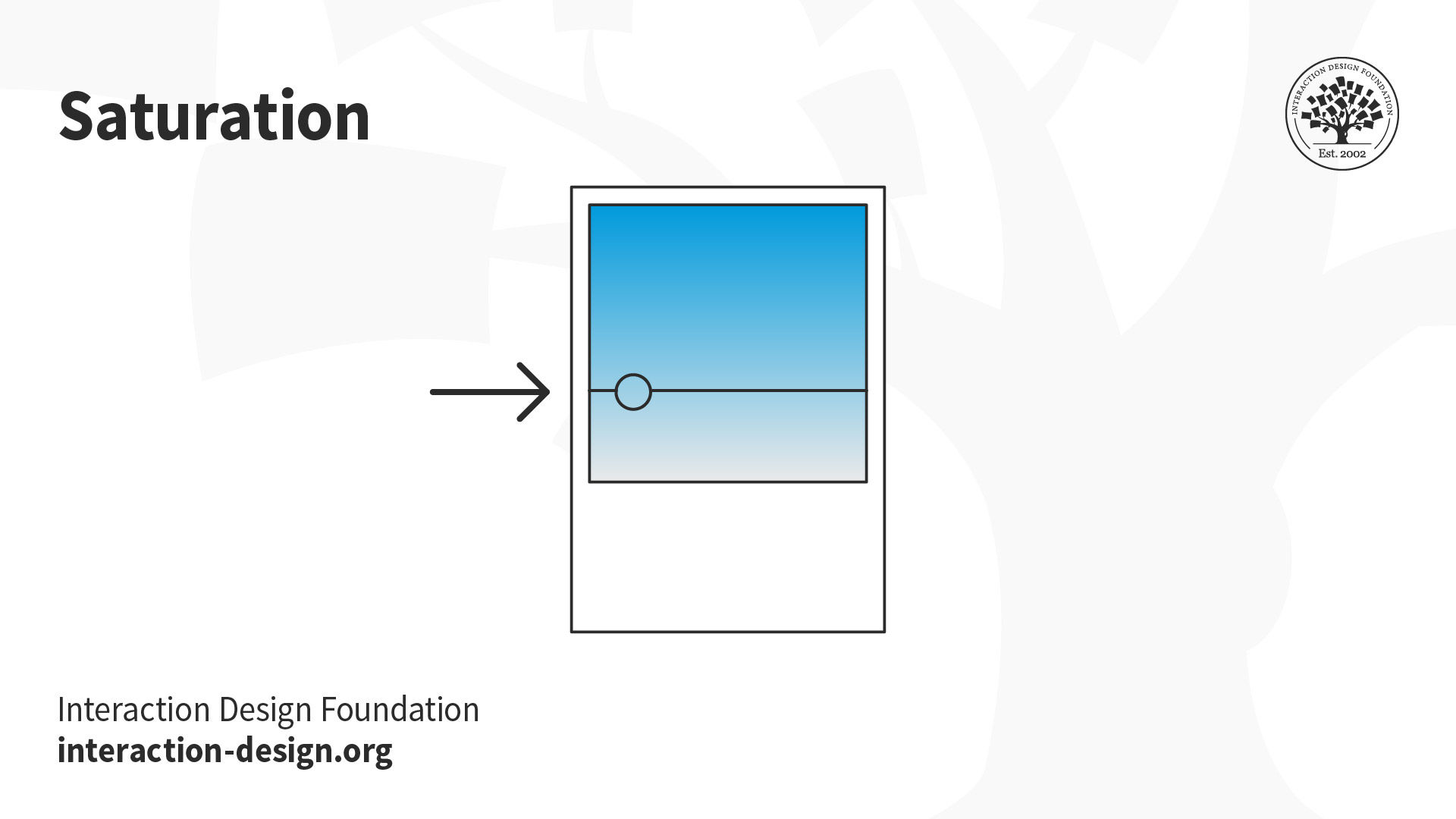
Saturation measures the intensity/purity of a color. The more saturated a color is, the more vivid it appears to be. A less saturated color will appear to be more muted and grey. For example, crimson would be a more saturated red, while brick would be a more desaturated red.

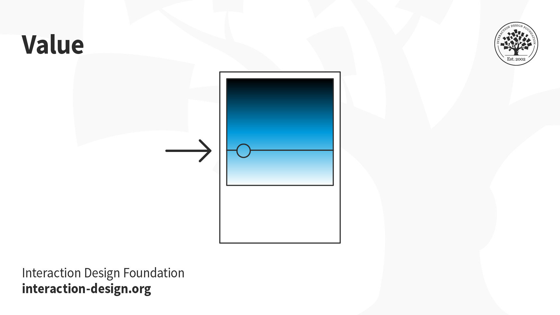
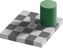
Brightness refers to the lightness or darkness of a color. Think of the typical greyscale, where colors range from a lighter white to grey to a darker black. When we add white to a color, we end up with a tint of that color. When black is added, we get a shade. Brightness may sometimes be referred to as "value."

Color Constancy

What color do you see this dress as? White and Gold or Blue and Black? It's confusing how people can perceive the dress so differently, and color constancy helps explain this strange phenomenon.
Color is informed by its context; it is relative to all the colors around it. Color constancy is the brain’s effort to recognize a familiar object as a consistent color regardless of the light that is reflected off it.

The Dress

For example, in this image, we can perceive the couch to be a white/beige despite the fact that the image's rgb value there is blue:

Blue couch color illusion

This image demonstrates how our eyes will "subtract" the lighting of the situation in order to identify the actual color of the object.

Lighting subtraction example

While our brain's ability to adjust for the situation is helpful, it may sometimes trick us. Here's an example by the checker shadow illusion. Squares A and B are the same color, but most people see A as being a darker shade of grey than B. When you put a color picker to it, both are #6F6F6F.

Checker Shadow Illusion Checker Proof

Now that you've got a sense of how your eyes will adjust for the colors you see, here's an explanation for "The Dress." In the original image of the dress, the lighting conditions were ambiguous, which led people to perceive the "true" color of the dress differently. If you saw the dress as white and gold: Your brain subconsciously assumed the dress was in shadow. Shadows tend to overrepresent blue light, so your brain mentally subtracted blue to adjust for the lighting. This resulted in a perception of a dress that appeared brighter and more yellow — a "white and gold" dress. If you saw the dress as black and blue: Your brain subconsciously assumed the dress was in light. Light tends to overrepresent yellow light, so your brain mentally subtracted yellow to adjust for the lighting. This resulted in a perception of a dress that appeared darker and more blue — a "black and blue" dress.

Dress explanation image

If you need help understanding how lighting is associated with blue or yellow, here is an example of how artists paint shadows in a bluer tone and light in a yellower tone to create the illusion of lighting:

Artistic lighting example

Sources